> ## Documentation Index
> Fetch the complete documentation index at: https://docs.9pic.ai/llms.txt
> Use this file to discover all available pages before exploring further.
# Branding & Theme
> Set your theme colour, header style, header call-to-action, organisation name, logo, and favicon.
## Overview
The **Branding & Theme** tab controls the visual identity of your event gallery website: theme colour, header design, an optional call-to-action button, your organisation name, logo, and favicon.
**Plan availability:** Branding & Theme is editable on **all plans** — there's no plan gate on this tab in the dashboard.

 ## How to Open
Click **Settings** in the sidebar.
Click the **Branding & Theme** tab. This tab is selected by default when you open Settings.
You can also open it directly at `/settings?tab=branding`.
***
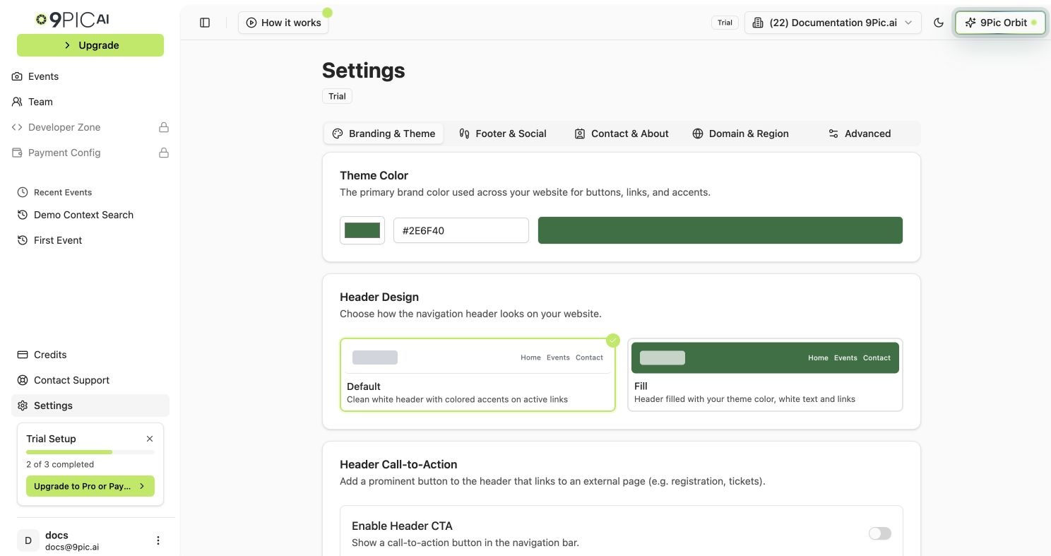
## Theme Colour
The theme colour is used for buttons, active link highlights, and accents across your gallery website. If you choose the **Fill** header design, it also fills the header background.
In the **Theme Color** card, click the colour swatch on the left to open a colour picker, or type a hex value into the text field (e.g. `#2E6F40`).
The bar on the right of the colour input updates in real time to show the selected colour.
Click **Save Branding Changes** at the bottom of the page.
The default theme colour is `#2E6F40`. Use a colour with enough contrast against white so buttons stay readable.
***
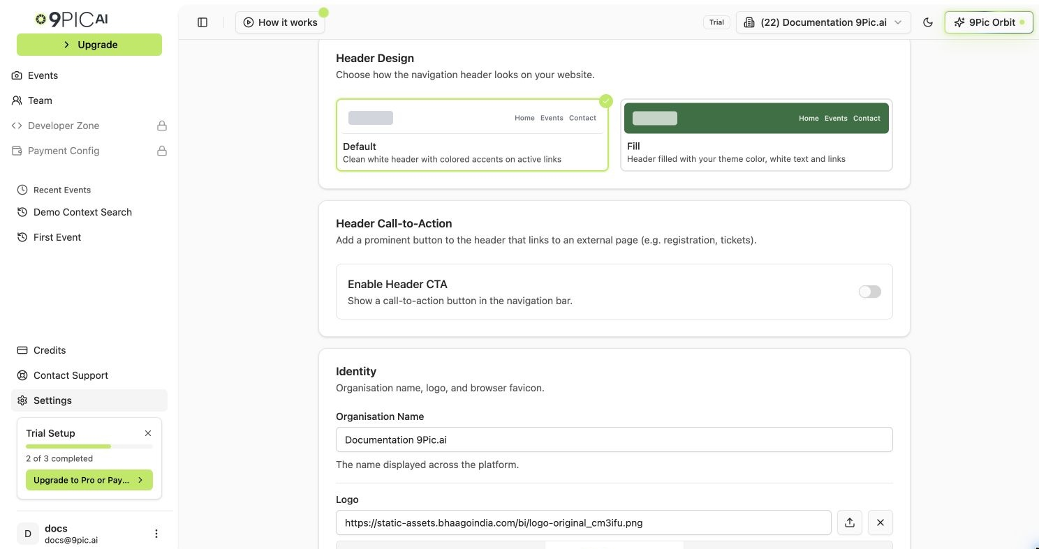
## Header Design
Choose how the navigation header looks at the top of your gallery website. The tab shows a live preview of each option side by side.
| Style | What it looks like |
| :---------- | :-------------------------------------------------------------------------- |
| **Default** | Clean white header with coloured accents on active links. |
| **Fill** | Header background filled with your theme colour, with white text and links. |
Click either the **Default** or **Fill** card. A blue checkmark badge appears on the selected style.
Click **Save Branding Changes** at the bottom of the page.
## How to Open
Click **Settings** in the sidebar.
Click the **Branding & Theme** tab. This tab is selected by default when you open Settings.
You can also open it directly at `/settings?tab=branding`.
***
## Theme Colour
The theme colour is used for buttons, active link highlights, and accents across your gallery website. If you choose the **Fill** header design, it also fills the header background.
In the **Theme Color** card, click the colour swatch on the left to open a colour picker, or type a hex value into the text field (e.g. `#2E6F40`).
The bar on the right of the colour input updates in real time to show the selected colour.
Click **Save Branding Changes** at the bottom of the page.
The default theme colour is `#2E6F40`. Use a colour with enough contrast against white so buttons stay readable.
***
## Header Design
Choose how the navigation header looks at the top of your gallery website. The tab shows a live preview of each option side by side.
| Style | What it looks like |
| :---------- | :-------------------------------------------------------------------------- |
| **Default** | Clean white header with coloured accents on active links. |
| **Fill** | Header background filled with your theme colour, with white text and links. |
Click either the **Default** or **Fill** card. A blue checkmark badge appears on the selected style.
Click **Save Branding Changes** at the bottom of the page.
 ***
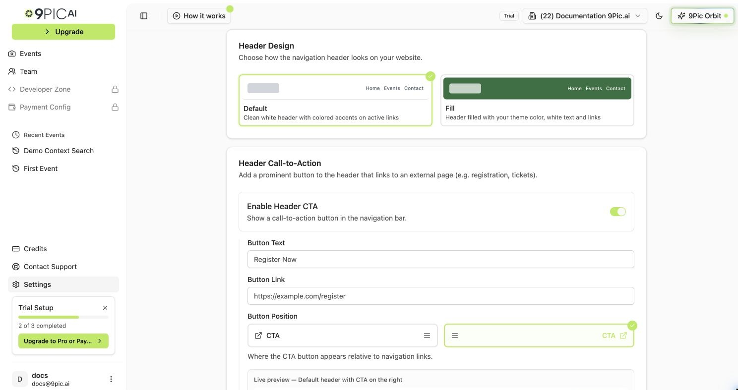
## Header Call-to-Action Button
Add one prominent button to the website header that links to any URL — useful for registration pages, ticketing, or your main website.
In the **Header Call-to-Action** card, turn the **Enable Header CTA** switch on. The button text, link, and position fields appear below it.
Type the button label in the **Button Text** field (e.g. `Register Now`).
Paste the full URL in the **Button Link** field (e.g. `https://example.com/register`).
Click **Left** or **Right** to place the button on the left or right side of the navigation links. A live preview shows the current setup.
Click **Save Branding Changes** at the bottom of the page.
The button text, link, and position fields only appear after you turn the **Enable Header CTA** switch on. Turn it off to hide the CTA from your website without losing the saved values.
Keep the button text short and action-oriented — "Register Now", "Get Tickets", or "Learn More" all work well.
***
## Header Call-to-Action Button
Add one prominent button to the website header that links to any URL — useful for registration pages, ticketing, or your main website.
In the **Header Call-to-Action** card, turn the **Enable Header CTA** switch on. The button text, link, and position fields appear below it.
Type the button label in the **Button Text** field (e.g. `Register Now`).
Paste the full URL in the **Button Link** field (e.g. `https://example.com/register`).
Click **Left** or **Right** to place the button on the left or right side of the navigation links. A live preview shows the current setup.
Click **Save Branding Changes** at the bottom of the page.
The button text, link, and position fields only appear after you turn the **Enable Header CTA** switch on. Turn it off to hide the CTA from your website without losing the saved values.
Keep the button text short and action-oriented — "Register Now", "Get Tickets", or "Learn More" all work well.
 ***
## Identity
### Organisation Name
The organisation name is displayed across the dashboard and on your gallery website.
In the **Identity** card, type your organisation's name into the **Organisation Name** field.
Click **Save Branding Changes** at the bottom of the page.
### Logo
Your logo appears in the header of your gallery website.
Click the **Logo** field to upload an image file, or paste a public image URL.
Click **Save Branding Changes** at the bottom of the page.
Use a transparent PNG for the best look across both the Default and Fill header styles. **Maximum file size: 300KB.**
### Favicon
The favicon is the small icon that appears in browser tabs.
Click the **Favicon** field to upload an image, or paste a public image URL.
Click **Save Branding Changes** at the bottom of the page.
Recommended favicon size is **32x32** or **16x16** pixels. **Maximum file size: 100KB.**
***
## Common Questions
It is used for buttons, active link highlights, and accents across your gallery website. If you choose the **Fill** header design, it also fills the header background.
No — only one header CTA button is supported. Choose the most important action for your visitors.
Upload a higher-resolution PNG with a transparent background. Make sure the file is under the 300KB limit.
Clear your browser cache or open the site in a private window. Browsers cache favicons for a long time.
The button is disabled until you change a field on this tab. If you have edited the form and the button is still disabled, check for validation messages under each field.
## Next Steps
Add footer text and social media icons to every page.
Embed a contact form and write your About Us page.
Set your country or connect a custom domain.
***
## Identity
### Organisation Name
The organisation name is displayed across the dashboard and on your gallery website.
In the **Identity** card, type your organisation's name into the **Organisation Name** field.
Click **Save Branding Changes** at the bottom of the page.
### Logo
Your logo appears in the header of your gallery website.
Click the **Logo** field to upload an image file, or paste a public image URL.
Click **Save Branding Changes** at the bottom of the page.
Use a transparent PNG for the best look across both the Default and Fill header styles. **Maximum file size: 300KB.**
### Favicon
The favicon is the small icon that appears in browser tabs.
Click the **Favicon** field to upload an image, or paste a public image URL.
Click **Save Branding Changes** at the bottom of the page.
Recommended favicon size is **32x32** or **16x16** pixels. **Maximum file size: 100KB.**
***
## Common Questions
It is used for buttons, active link highlights, and accents across your gallery website. If you choose the **Fill** header design, it also fills the header background.
No — only one header CTA button is supported. Choose the most important action for your visitors.
Upload a higher-resolution PNG with a transparent background. Make sure the file is under the 300KB limit.
Clear your browser cache or open the site in a private window. Browsers cache favicons for a long time.
The button is disabled until you change a field on this tab. If you have edited the form and the button is still disabled, check for validation messages under each field.
## Next Steps
Add footer text and social media icons to every page.
Embed a contact form and write your About Us page.
Set your country or connect a custom domain.